# Demystifying AppFlowy Editor's Codebase

by Mayur, as part of the AppFlowy Mentorship Program

## Introduction

The AppFlowy Editor package is one of the core components of AppFlowy. It is a popular package in the Flutter Community, offering highly customizable rich text editing experience.

This article is aimed at people looking to use the AppFlowy Editor in their own projects and at people who want to contribute to this package. It describes the project folder structuring and strategies for adding new features.

## Components of the Editor

Let’s explore what actually happens behind the scenes when a user creates a document with the AppFlowy Editor and discuss how that relates to its underlying components.

### The Selection Menu

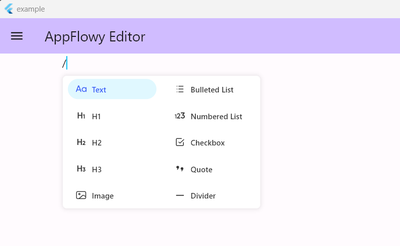
When you start the Editor, you are asked to press the `/` (slash) key on your keyboard to get the Selection Menu.

The Selection Menu allows you to insert editor plugins or components.

<figure><img src="https://lh5.googleusercontent.com/fltRc-XUxEF4VFw0axXYMwE-Ie2gZ0zkUMOx8-1QHdiZEvA5egM9MuTsWBUg3lyULEvv0Uib-_YGCziBSjEfJKV_YX2rVoY6QdbL9fowaj5mNngDincbV5cS0s9j9m9C4pF1MUh3Hxv0k7akKaGegqQ" alt="" width="375"><figcaption><p>the selection menu</p></figcaption></figure>

Below is the code for the SelectionMenuWidget:

```dart
//appflowy-editor\lib\src\editor\selection_menu\selection_menu_widget.dart
class SelectionMenuWidget extends StatefulWidget {
  const SelectionMenuWidget({
    //constructor ...
  }) : super(key: key);
  
  final List<SelectionMenuItem> items;
  final int itemCountFilter;
  final int maxItemInRow;

  final SelectionMenuService menuService;
  final EditorState editorState;

  final VoidCallback onSelectionUpdate;
  final VoidCallback onExit;

  final SelectionMenuStyle selectionMenuStyle;

  final bool deleteSlashByDefault;

 //variable declarations
}

class _SelectionMenuWidgetState extends State<SelectionMenuWidget> {
...
}

```

The EditorState (the property `editorState` ) is an entity that encapsulates the state of the entire Editor and includes the services of the editor (discussed below).

The SelectionMenuService (the property `selectionMenuService`) is responsible for implementing the UI for the SelectionMenu. It achieves this by adding `OverlayEntry` on top of the Editor widget. This is a pattern you will encounter again when you explore the `Toolbar` and `FindAndReplace` plugins.

### Selection Menu Items

The `items` property of the SelectionMenuWidget is assigned a list of `SelectionMenuItems`.

Selection Menu Items consist of the following options which you see on the Selection Menu, such as:

* Text
* H1
* Image
* Quote
* Checkbox

This is what a typical `SelectionMenuItem` instance looks like:

```dart
// appflowy-editor\lib\src\editor\selection_menu\selection_menu_service.dart
SelectionMenuItem(
    name: AppFlowyEditorLocalizations.current.bulletedList,
    icon: (editorState, isSelected, style) => SelectionMenuIconWidget(
      name: 'bulleted_list',
      isSelected: isSelected,
      style: style,
    ),
    keywords: ['bulleted list', 'list', 'unordered list'],
    handler: (editorState, _, __) {
      insertBulletedListAfterSelection(editorState);
    },
  ),
```

As you can see we have parameters for:

* name
* icon
* keywords
* handler

The *keywords* are used to filter results from the menu, and are matched against what you type after pressing `/` (slash).

The *handler* serves as a callback for when the user clicks on the SelectionMenuItem. This handler can be used to insert a node, transform the current node, and much more.

Once this node is inserted into the Document, the Editor searches for that node's respective BlockComponentBuilder to render it on the Editor.

### Nodes

Node is a class that is actually stored in the Document Tree.

Let us take a look at the definition of Node class:

```dart
// appflowy-editor\lib\src\core\document\node.dart
final class Node extends ChangeNotifier with LinkedListEntry<Node> {
  Node({
    required this.type,
    String? id,
    this.parent,
    Attributes attributes = const {},
    Iterable<Node> children = const [],
  })  : _children = LinkedList<Node>()
          ..addAll(
            children.map(
              (e) => e..unlink(),
            ),
          ), // unlink the given children to avoid the error of "node has already a parent"
        _attributes = attributes,
        id = id ?? nanoid(10) {
    for (final child in this.children) {
      child.parent = this;
    }
  }

  /// Parses an [Map] into a [Node]
  factory Node.fromJson(Map<String, Object> json){...}
  // other useful definitions and methods.
}
```

It has a `type` that defines the type of the node such as the heading, todo\_list, etc.

This type is used to determine which Block Component to render on the Flutter App, this determining logic is done by `BlockComponentRendererService`, which we will talk about later.

It has `attributes` that control its appearance and state. For example, todo\_list has an attribute called "checked" which determines whether it is completed or incomplete.

The `children` parameter defines the children of the node, these are stored in a LinkedList which combined with the Document Tree allows the Editor to support Node Hierarchy.

To learn more about Node and its properties, read this [article](https://blog-appflowy.ghost.io/how-we-built-a-highly-customizable-rich-text-editor-for-flutter/).

### Block Components

Each Node type has a corresponding BlockComponentBuilder which functions as a widget builder. It accepts a Node as an input and produces a Widget as an output, allowing you to get a [Flutter widget](https://api.flutter.dev/flutter/widgets/Widget-class.html) for a Node.

Take a look at the implementation of `BlockComponentBuilder` class at this location:

```
appflowy-editor\lib\src\editor\editor_component\service\renderer\block_component_service.dart
```

An example that implements the `BlockComponentBuilder` to show the bulleted\_list in the editor can be found here:

```
appflowy-editor\lib\src\editor\block_component\bulleted_list_block_component\bulleted_list_block_component.dart
```

### Putting it All Together

So let's outline what actually happens behind the scenes when we press a slash on the Editor and select an option, such as a Heading.

1. First, when we press `\` (slash), the `SelectionMenu` appears with a bunch of `SelectionMenuItems`.
2. When we click the Heading item, a Node of the corresponding type ('heading') gets inserted in the **Editor Document Tree** using the `EditorState`.
3. The `AppFlowyEditor` then looks at its newly added node and searches for its corresponding `BlockComponentBuilder` using the type of the Node. So it will search for a BlockComponentBuilder for type 'heading'. Once found, it executes the builder to show a Flutter representation of the Heading Node.

## Folder Organization

Now that we have a basic understanding of how things are happening inside the Editor and how its components work, let's explore the Folder organization to get an understanding of what is located where and discuss some other important modules that are part of the AppFlowyEditor.

Here is the organization of folders that make the AppFlowyEditor package:

`AppFlowy-Editor`\
`├── example`\
`├── lib`\
`├── ├── l10n`\
`├── ├── src`\
`├── ├── ├── core`\
`├── ├── ├── editor`\
`├── ├── ├── extensions`\
`├── ├── ├── history`\
`├── ├── ├── infra`\
`├── ├── ├── l10n`\
`├── ├── ├── plugins`\
`├── ├── ├── render`\
`├── ├── ├── service`\
`├── ├── └── editor_state.dart`\
`├── └── appflowy_editor.dart`\
`├── test`\
`└──pubspec.yaml`

We are mainly concerned about the `lib/src` folder, which is the main source code for our package.

Below is an overview of notable folders inside `src` and understand what they contain.

### src\core

This is the library that contains the core modules such as node, path, attributes, position, selection, transaction, document, and more. To learn more about what these actually are, read this [article](https://blog-appflowy.ghost.io/how-we-built-a-highly-customizable-rich-text-editor-for-flutter/).

### src\editor

This folder consists of all the significant modules and components such as various BlockComponents, the EditorComponent itself, various plugins like the SelectionMenu, Toolbar, FindAndReplace, and some utilities.

When you expand this folder you will see the following subdirectories.\
\
`src/editor`\
`├── block_component`\
`├── command`\
`├── editor_component`\
`├── find_replace_menu`\
`├── selection_menu`\
`├── toolbar`\
`└── editor.dart`

#### block\_component

The block\_component consists of a collection of block\_components such as headings, bulleted\_lists, image\_block\_components, etc. We have already mentioned some of them.

#### editor\_component

The EditorComponent is the root node of the document tree. Its job is to hold all other components, display these components, and allow scrolling, typing, and listening to Shortcut Events. It is a class implementing the `BlockComponentBuilder` with a Node type of 'page'.

The `editor_component\service` contains the scroll service, keyboard service, selection service, shortcuts, IME service, and the definitions of `BlockComponentBuilder` itself within this directory:

```
editor_component\service\renderer
```

Each one of these services is worth an article explaining, but I urge the reader to explore more about them at their convenience.

Other modules inside editor\_components include:

* find\_replace\_menu
* toolbar
* selection\_menu

All of them are helpful features that serve some purpose of enhancing the use of AppFlowyEditor for managing data in the Document.

As the name suggests, the **find\_replace\_menu** finds and replaces character matches, and the **toolbar** is used to style different nodes on the editor.

<figure><img src="https://1003959744-files.gitbook.io/~/files/v0/b/gitbook-x-prod.appspot.com/o/spaces%2Fvs4LQcuzr0JR34ApS5sM%2Fuploads%2FnqCUafFgrR9qUqL1zOXf%2Fimage.png?alt=media&#x26;token=20bb7af3-1952-4bd8-8e10-f415a85af0f4" alt=""><figcaption><p>the toolbar feature.</p></figcaption></figure>

Finally, the editor\_component also includes a folder called `command` and `utils`.

The **command** folder consists of utility methods such as the opertions TextTransform and SelectionTransform.

The **util** folder contains various utilities such as File Picker, raw\_keyboard\_extension, etc. that are used in various Editor features.

### src\editor\_state.dart

The EditorState class is at the heart of the AppFlowyEditor. It contains:

* The state of the Editor, including:
  * the document to render
  * the state of the selection
* Various services (discussed below) of the Editor, such as:
  * Selection service
  * Scroll service
  * Keyboard service
  * Renderer service
* the editor style
* the Undo Manager
* methods that mutate the document.

Below is an overview of the class:

```dart
// lib\src\editor_state.dart
class EditorState {
  EditorState({ required this.document, }) {...}

  final Document document;

  /// The style of the editor.
  late EditorStyle editorStyle;

  /// The selection of the editor.
  Selection? get selection => selectionNotifier.value;

  /// Sets the selection of the editor.
  set selection(Selection? value)...
  
  /// Stores the selection menu items.
  List<SelectionMenuItem> selectionMenuItems = [];

  /// listen to this stream to get notified when the transaction applies.
  Stream<(TransactionTime, Transaction)> get transactionStream => ...);

  Transaction get transaction {...}

  ///applying a transaction
  Future<void> apply(){...}
  ...
}
```

In the above code, you can see a getter `Transaction get transaction{...}`. This gives me a chance to introduce a crucial topic for our discussion: the `Transaction`.

Here is the definition of Transaction in the codebase:

> A \[Transaction] has a list of \[Operation] objects that will be applied to the editor.

The [Transaction](https://blog.appflowy.io/how-we-built-a-highly-customizable-rich-text-editor-for-flutter/#transactions) controls state of the editor and when it is refreshed. Each change you want to make through the editor is made by fetching the Transaction instance within the EditorState (done by the getter we talked about earlier) and calling the `apply` method of the EditorState.

You may ask why we have to use a Transaction instead of directly mutating the Document contained within the EditorState. Well, mutating the document with its API is not recommended because you must consider the implications of collaborative editing.

Here is an example of a transaction used in the **remove\_word\_command.dart** file:

```dart
// src\editor\editor_component\service\shortcuts\command_shortcut_events\remove_word_command.dart
  ...

  final transaction = editorState.transaction;
  transaction.deleteText(
    node,
    selection.end.offset,
    endOfWord.offset - selection.end.offset,
  );

  editorState.apply(transaction);
  
  ...
```

In the above code, you can see that we are calling a method called `deleteText` of the class Transaction. Similarly, there are other useful methods in this class, which change the content and state of the document.

Explore the class by looking in:

```
lib\src\core\transform\transaction.dart
```

### src\extensions

This directory consists of helpful extensions on Attributes, Colors, TextSpan, Node, Position, and much more.

### src\plugins

This is a family of plugins that make data encoding and decoding possible with popular formats such as HTML, Markdown, and Quill Delta. We use a `Document` class to convert the contents of our Editor to these formats.

Here are the contents:\
\
`src\plugins`\
`├── html`\
`├── markdown`\
`├── quill_delta`\
`└── plugins.dart`

It is essential that we allow the contents of our Document to be converted to these formats because we want to allow our data to be synced across the web and other tools. These plugins are how we achieve this.

That concludes our discussion on the folder organization of the AppFlowyEditor package.

## Services in EditorState

Let's discuss the various services that the EditorState hosts.

These services are crucial for the working of the AppFlowyEditor. They are provided to the EditorState through a class called: `EditorService` located in:

```
lib\src\editor\editor_component\service\editor_service.dart
```

### Selection Service

This service is responsible for processing the \[Selection] changes and updates such as making a selection, updating a selection, getting the selected nodes, etc. Check out its interface:

```dart
// lib\src\editor\editor_component\service\selection_service.dart

abstract class AppFlowySelectionService {
  ValueNotifier<Selection?> get currentSelection;

  List<Node> get currentSelectedNodes;
  
  void updateSelection(Selection? selection);
  
  void clearSelection();

  void clearCursor();

  Node? getNodeInOffset(Offset offset);

  Position? getPositionInOffset(Offset offset);
  
  List<Rect> get selectionRects;

  void registerGestureInterceptor(SelectionGestureInterceptor interceptor);
  void unregisterGestureInterceptor(String key);
}
```

In AppFlowyEditor, there are different implementations of the SelectionService for desktop and mobile. I encourage the reader to explore them too.

### Keyboard Service

This service is responsible for processing shortcut keys. If this service is enabled then only the ShortcutEvents are processed, if we disable this service then the shortcuts are not processed.

This service is also used to control the keyboard behavior in AppFlowyEditor mobile.

```dart
// lib\src\editor\editor_component\service\keyboard_service.dart

abstract class AppFlowyKeyboardService {
  void enable();
  
  void disable();
  
  /// Used in mobile
  void closeKeyboard();
  
  /// Used in mobile
  void enableKeyBoard(Selection selection);
}  
```

### Scroll Service

This service is responsible for processing document scrolling. It also contains information about number of pages in the document, maximum scroll height on the vertical axis, etc.

Probably its most used method is its `scrollTo(double dy, {Duration duration})` method, which scrolls to dy in the duration. Everything inside the scroll service:

```dart
// lib\src\editor\editor_component\service\scroll_service.dart

abstract class AppFlowyScrollService implements AutoScrollerService {
  double get dy;
  double? get onePageHeight;
  int? get page;
  double get maxScrollExtent;
  double get minScrollExtent;
  ScrollController get scrollController;

  void scrollTo(
    double dy, {
    Duration? duration,
  });

  void goBallistic(double velocity);

  void enable();

  void disable();
}
```

### Renderer Service

This service is responsible for registering render plugin with specified `Node.type`.

Earlier we talked about how the content of the Editor is an instance of some type of Node, an image on your screen is represented as a Node of type 'image' in the document.

Determining which BlockComponentWidgetBuilder to use for which type of Node is done using this service. Let's take a look at its interface:

```dart
// lib\src\editor\editor_component\service\renderer\block_component_service.dart

abstract class BlockComponentRendererService {
  void register(String type, BlockComponentBuilder builder);

  void registerAll(Map<String, BlockComponentBuilder> builders) =>
      builders.forEach(register);

  void unRegister(String type);

  BlockComponentBuilder? blockComponentBuilder(String type);

  Widget build(
    BuildContext buildContext,
    Node node,
  );

  List<Widget> buildList(
    BuildContext buildContext,
    Iterable<Node> nodes,
  );
}
```

So far, we have discussed all the crucial services in the AppFlowy Editor. But we have only discussed their interfaces, the actual implementation of these Services is where a lot of magic happens.

## Strategies and Tips to Use AppFlowyEditor

Now that you are familiar with the codebase and you understand how things are working. Here are strategies that will help you to use AppFlowyEditor and contribute to the package.

### Most Updates Are For Existing Components

Most of the time, we will want to update existing Editor Plugins/Components, Shortcuts, and features like Toolbar, Context Menu, FindAndReplaceMenu, etc.

To do so, look up their implementations and apply your modifications.

### Adding New Components

To add new Components, you have to follow the following steps:

1. Create a Node definition with Node keys and a method for returning the Node. So for example here is the same for QuoteNode:

```dart
// lib\src\editor\block_component\quote_block_component\quote_block_component.dart
class QuoteBlockKeys {
  const QuoteBlockKeys._();
  static const String type = 'quote';
  static const String delta = blockComponentDelta;
  static const String backgroundColor = blockComponentBackgroundColor;
  static const String textDirection = blockComponentTextDirection;
}

Node quoteNode({
  Delta? delta,
  String? textDirection,
  Attributes? attributes,
  Iterable<Node>? children,
}) {
  attributes ??= {'delta': (delta ?? Delta()).toJson()};
  return Node(
    type: QuoteBlockKeys.type,
    attributes: {
      ...attributes,
      if (textDirection != null) QuoteBlockKeys.textDirection: textDirection,
    },
    children: children ?? [],
  );
}
```

2. Create a class implementing the `BlockComponentBuilder`

```dart
class QuoteBlockComponentBuilder extends BlockComponentBuilder {
  QuoteBlockComponentBuilder({
    this.configuration = const BlockComponentConfiguration(),
    this.iconBuilder,
  });

  @override
  final BlockComponentConfiguration configuration;

  final BlockIconBuilder? iconBuilder;

  @override
  BlockComponentWidget build(BlockComponentContext blockComponentContext) {
    final node = blockComponentContext.node;
    return QuoteBlockComponentWidget(
      key: node.key,
      node: node,
      configuration: configuration,
      iconBuilder: iconBuilder,
      showActions: showActions(node),
      actionBuilder: (context, state) => actionBuilder(
        blockComponentContext,
        state,
      ),
    );
  }

  @override
  bool validate(Node node) => node.delta != null;
}
```

3. Create the Widget that will be the UI of your custom component by extending `BlockComponentStatefulWidget`. In this example, this `QuoteBlockComponentWidget` is the corresponding stateful widget.
4. Finally, make sure you add a SelectionMenuItem for adding your custom Node into the Selection Menu and add your BlockComponentBuilder to the AppFlowyEditor. This way when someone presses the selection menu they will be able to see your custom component. If you need more help on this let me know, I am writing a separate article to explain this.

### Adding New Features

To add new features, you can refer to existing features that are implemented, take that as a base, and then develop your desired functionality.

For instance: while developing the FindAndReplaceMenu, I borrowed a lot of code from the Selection Menu in order to facilitate the rendering of the FlutterWidget onto the Editor.

### Adding and Customizing Shortcuts

AppFlowy Editor supports two types of shortcuts that are CommandShortcutEvents and CharacterShortcutEvents.

*Command Shortcuts* get triggered when the user types a certain key combination on their keyboard. Examples of this are `FormatBold`, `FormatItalic`, `CopyCommand`, etc.

*Character Shortcuts* get triggered when the Editor encounters a certain character being typed into the page. Examples include the `SlashCharacterEvent`, `DividerCharacterEvent`, etc. You can read more about shortcuts and how to customize them in our guide to [Customizing Editor Features](https://github.com/AppFlowy-IO/appflowy-editor/blob/main/documentation/customizing.md).

To add a new command shortcut, create an instance of `CommandShortcutEvent` and provide it with a key, a default command, platform-specific commands, and a handler. Here is an example of a CommandShortcutEvent instance.

```dart
// src\editor\editor_component\service\shortcuts\command_shortcut_events\remove_word_command.dart
final CommandShortcutEvent deleteLeftWordCommand = CommandShortcutEvent(
  key: 'delete the left word',
  command: 'ctrl+backspace',
  macOSCommand: 'alt+backspace',
  handler: _deleteLeftWordCommandHandler,
);

//handler for the above command
CommandShortcutEventHandler _deleteLeftWordCommandHandler = (editorState) {
...
return KeyEventResult.handled;
}
```

Finally, provide this new command event to the AppFlowyEditor.

If you want to include it in the standard shortcut events that come by default with the Editor, then to do so, add your shortcut in the `standardCommandShortcutEvents` which you can find at:

```
appflowy-editor\lib\src\editor\block_component\standard_block_components.dart`
```

### Write Tests

To ensure the robustness and reliability of your new features, components, and shortcuts in AppFlowy Editor, it's essential to write comprehensive tests. Writing tests not only verifies the correctness of your code but also provides insights into what is happening behind the scenes. Well-written tests are a valuable contribution to the project and make life easier for contributors.

Let's see how you can write tests for AppFlowy Editor:

#### Test Strategies

When writing tests for AppFlowy Editor, you'll typically work with `UnitTest`s or `WidgetTest`s. Follow these strategies to create effective tests:

1. **Test Organization**: Organize your tests by creating a new file or folder under the `appflowy_editor\test` directory for each new feature you want to test.
2. **Test Scenarios**: Tests should cover expected behaviors as well as edge cases. For example, when testing features related to text selection, consider scenarios where a large amount of text is selected as well as when only a single character is selected.
3. **Descriptive Tests**: Write clear and descriptive test messages and comments to enhance readability and understanding.
4. **Platform Considerations**: If your feature behaves differently on various platforms (e.g., Windows, Linux, Mac), write platform-specific tests to ensure cross-compatibility.
5. **Reuse Utilities**: Use existing test utilities provided by the package and create feature-specific utility classes for common operations to promote reusability.

#### Testing a Feature

Let's walk through an example of writing tests for the "**Find And Replace**" Plugin in AppFlowy Editor. The code for this example can be found in the `appflowy_editor\test\new\find_replace_menu` directory.

In this directory you can see four files:

`find_replace_menu`\
`├── find_replace_menu_find_test.dart`\
`├── find_replace_menu_replace_test.dart`\
`├── find_replace_menu_utils.dart`\
`└── search_algorithm_test.dart`

Since the feature is moderately large, we have created a folder for it and inside this folder we have created files to individually test our sub-features.

**Unit Tests**

In the case of unit tests, you focus on testing individual classes or units of code. Here's an example from `search_algorithm_test.dart`:

```dart
void main() {
  group('search_algorithm_test.dart', () {
    late SearchAlgorithm searchAlgorithm;

    setUp(() {
      searchAlgorithm = BoyerMoore();
    });

    test('returns the index of the only found pattern', () {
      const pattern = 'Appflowy';
      const text = 'Welcome to Appflowy 😁';

      List<int> result = searchAlgorithm.searchMethod(pattern, text);
      expect(result, [11]);
    });

    test('returns index if pattern is non-ASCII', () {
      ...
    });

    test('returns index if pattern is not separate word',() {
      ...
    });
    ...
  });
}
```

In this example, we're testing the SearchAlgorithm class. We initialize the necessary variables in the `setUp()` method and then write tests to verify expected behavior and edge cases.

Observe how the tests are testing the expected behavior as well as edge cases such as using non-ASCII characters, multiple matches found, etc.

**Widget Tests**

Widget tests involve testing the user interface components of the editor. To do this, you'll need to use the `TestableEditor` class, a wrapper around the `WidgetTester` class.

```
test\infra\new\testable_editor.dart
```

Now let us take a look at how we have written the Widget Tests for our feature. Let us go through the `find_replace_menu_find_test.dart`:

```dart
void main() async {
  setUpAll(() {
    TestWidgetsFlutterBinding.ensureInitialized();
  });

  group('find_replace_menu.dart findMenu', () {
    ...

    testWidgets('selects found match', (tester) async {
      const pattern = 'Welcome';

      final editor = tester.editor;
      editor.addParagraphs(3, initialText: text);

      await editor.startTesting();
      await editor.updateSelection(Selection.single(path: [0], startOffset: 0));

      await pressFindAndReplaceCommand(editor);
      await tester.pumpAndSettle();
      expect(find.byType(FindMenuWidget), findsOneWidget);

      await enterInputIntoFindDialog(tester, pattern);

      // if current selection consists an occurrence of matched pattern.
      final selection = editor.editorState.selection;
      // We expect the first occurrence of the pattern to be found and selected,
      expect(selection != null, true);
      expect(selection!.start, Position(path: [0], offset: 0));
      expect(selection.end, Position(path: [0], offset: pattern.length));

      await editor.dispose();
    });
  });
}
```

In our test **selects found match** we first load the editor instance for widget testing and initialize it with some paragraphs. There are other utilities for initializing the editor with some content, such as: `addNode`, `addEmptyParagraph`, etc.

```dart
final editor = tester.editor;
editor.addParagraphs(3, initialText: text);
```

If you have experience of writing widget tests in Flutter, you will be aware that typically you want to [pump](https://docs.flutter.dev/cookbook/testing/widget/introduction#notes-about-the-pump-methods) the widget that you want to test. However, for AppFlowy, this pump logic is already taken care by the TestableEditor class we mentioned above. So to pump the widget under test we call the following method:

```dart
await editor.startTesting();
```

Then in our test we perform the actual testing logic. This involves interacting with the contents of the Editor. For our example this includes:

* making a selection
* accessing nodes and performing operations on them
* sending keyboard events

We can make a selection within our Editor using the `updateSelection()` method. In our test we select the very first character on the first line:

```dart
await editor.updateSelection(Selection.single(path: [0], startOffset: 0));
```

To access nodes within your editor, you can use the `nodeAtPath` method as shown below:

```dart
final node = editor.nodeAtPath([2]);
```

Here we are choosing the 3rd node in the collection of nodes. Since nodes are zero-indexed.

Once you have access to a node you can check if it is null as well as verify its content and attributes. This is essential when you are testing something which may modify one or multiple nodes in the editor. For example, when testing the replace operation, we may want to access the text within a node before and after a replace operation.

So you can write something like:

```dart
expect(
  editor.nodeAtPath([0])?.delta?.toPlainText(),
  originalText,
);

replaceOperation();

expect(
  editor.nodeAtPath([0])?.delta?.toPlainText(),
  replacedText,
);
```

To send a keyboard event we use the `editor.pressKey()` method. In our test we are calling a method:

```dart
await pressFindAndReplaceCommand(editor);
```

This method is defined within **find\_replace\_menu\_utils.test** file. You can see at its core this method uses the `pressKey()` method to send Keyboard Events to our Editor, like this:

```dart
await editor.pressKey(
    key: openReplace ? LogicalKeyboardKey.keyH : LogicalKeyboardKey.keyF,
    isMetaPressed: Platform.isMacOS,
    isControlPressed: !Platform.isMacOS,
  );
```

Once we have interacted with our editor we finally check if we get the expected output or not. In our case we check our updated selection after executing the find operation.

```dart
expect(selection != null, true);
expect(selection!.start, Position(path: [0], offset: 0));
expect(selection.end, Position(path: [0], offset: pattern.length));
```

Review the following tests which are good models to follow as far as coverage and completeness go:

```
test\new\block_component\table_block_component
```

```
test\new\service\shortcuts\command_shortcut_events\backspace_command_test.dart
```

```
test\core
```

For additional testing examples, please review the `appflowy_editor\test` directory.

## Conclusion

I hope you enjoyed reading this article and I hope you now have a better grasp as to what actually happens behind the scenes when you use the Editor.

We have covered the notable actors in depth and touched on some other ones. We have gone over what folder is located where in the Editor, as well as what makes up the package. Finally, we discussed some ways we can contribute and use the package in our projects.

There are more things that we could not cover here, I urge the reader to explore them.

I would like to thank Lucas, my Mentor, and the AppFlowy community for their constant support.

## Questionnaire

Thanks for reading this article. If you have some time, please kindly take our 1-minute survey (TODO: link) to give us feedback and let us know what interests you the most.

If you have a suggestion or question for the calendar view or any part of AppFlowy, you can create an issue on Github and we’ll get back to you as soon as possible.

Also, feel free to follow us @appflowy on Twitter or join our Discord server to follow our latest development! (TODO: insert links)


---

# Agent Instructions: Querying This Documentation

If you need additional information that is not directly available in this page, you can query the documentation dynamically by asking a question.

Perform an HTTP GET request on the current page URL with the `ask` query parameter:

```
GET https://docs.appflowy.io/docs/blog-highlights/demystifying-appflowy-editors-codebase.md?ask=<question>
```

The question should be specific, self-contained, and written in natural language.
The response will contain a direct answer to the question and relevant excerpts and sources from the documentation.

Use this mechanism when the answer is not explicitly present in the current page, you need clarification or additional context, or you want to retrieve related documentation sections.
